In this modern age with all of its miraculous technology and ever-so-helpful devices, many of us have adopted a somewhat spartan relationship with maps. Our phones and computers show us where something is and tell us, or our cars, how to get there. In many cases, we do not need to consult or even look at a map. We merely need to follow directions. If every street, highway, and river can be seen on your phone, why would one need anything more? Indeed, what is the point of maps anymore?
Maps, by their very nature, have always been abstractions. It is difficult for our minds to conceive of vast distances between locations or to envision what a section of land looks like from high above. With maps, we are given a visual representation of space and distance that is easy for our mind to parse. Most modern maps, such as those given by a phone, provide information in a visually simple and utilitarian manner. For that is what the user wants, the quickest and easiest route to take on a trip. Any additional decoration or ornamentation could lead to the user getting confused or, even, lost. The appearance and content of a map is based on what is considered to be important to the creator and user.
Navigation has always been the main focus of maps, but it is not the only thing. Among many other things, maps have also been used to advertise products, illustrate historical trends and simply showcase incredible artistic inspiration. Case in point, the Library has a wonderful collection of pictorial maps. Many of them have been digitized and can be viewed on the Library’s Digital Collections site. Currently, there are 100 maps included in the online gallery with more to come. In the next few paragraphs, some of our favorites and a few of the new additions will be highlighted. It should soon become apparent that there is a whole other world of maps out there.
The first map we would like to show is the Bootlegger’s Map of the United States.
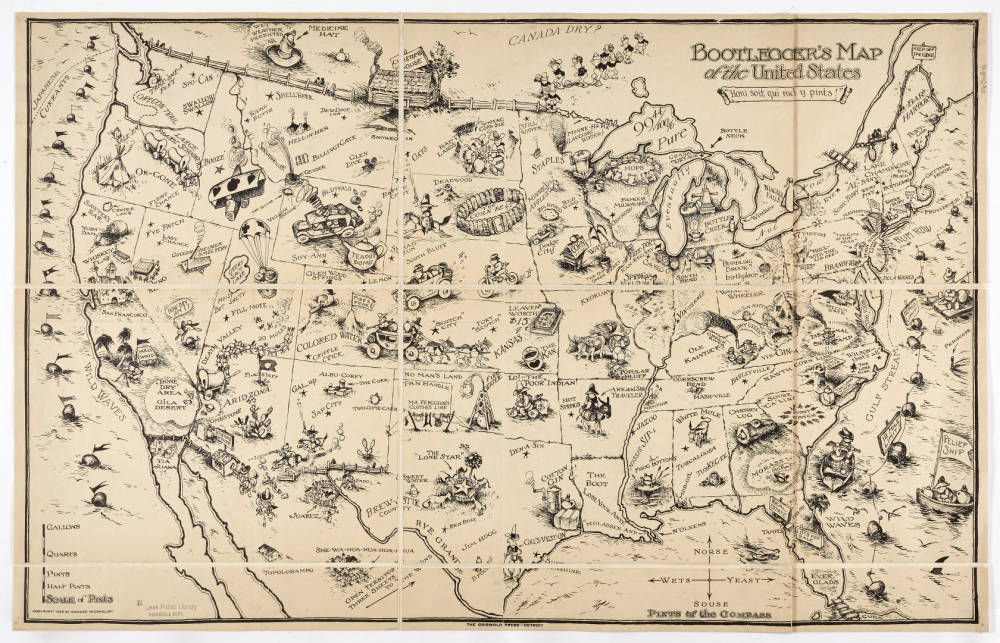
This map was created by Edward McCandish in 1926, during the height of Prohibition. The map includes many small cartoonish depictions of moonshiners and bootleggers across the country. Additionally, many states and areas are given new, and pun-laden names. For example, Louisiana is now known as “Lose-Your-Ante” and Chicago becomes “Chi-Keg-O”. There are many other humorous jokes scattered throughout the map waiting to be discovered by the diligent viewer. https://cdm17210.contentdm.oclc.org/digital/collection/p17210coll10/id/59/rec/10
Next, we turn our attention to this Map of Cape Cod created by Melanie Elisabeth Leonard, also from 1926. The 1920’s and 30’s really were the heyday of pictorial maps.
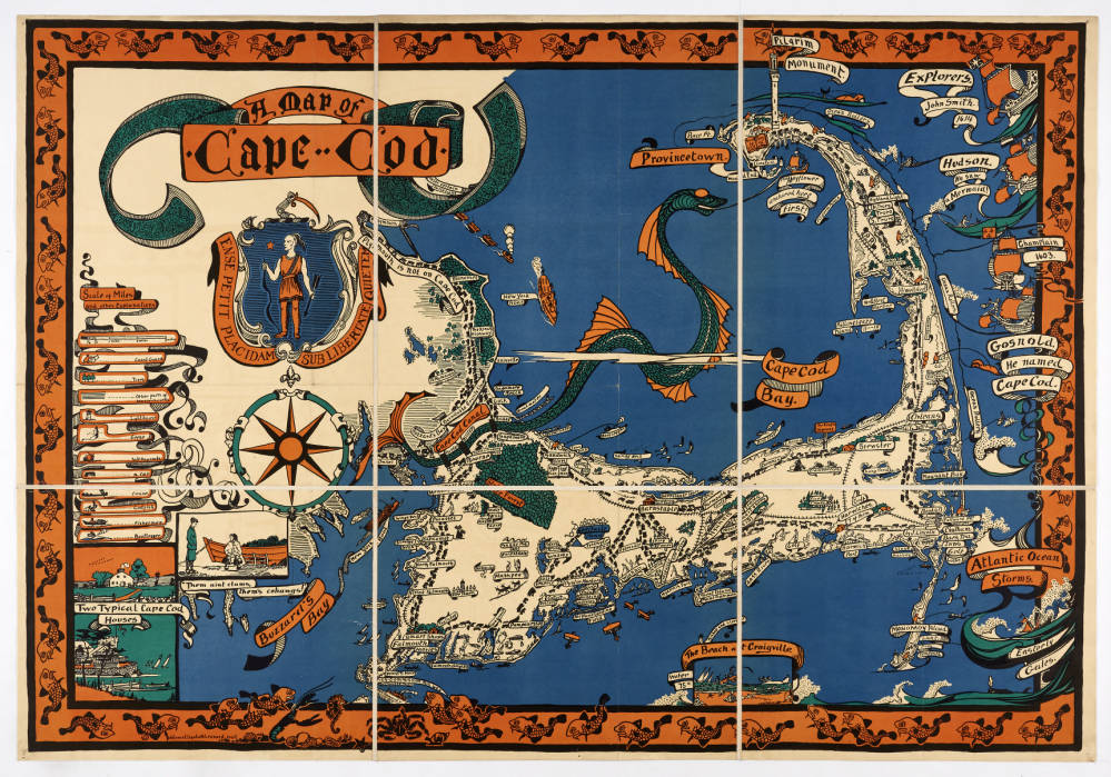
The striking red, white and blue of the map instantly catches the eye. The focal point of the map is obviously the large black and red sea serpent. Its long tail eventually becomes the Cape Cod Canal. Scattered about the place names are small drawings of Coast Guard cannoneers, some firing at whales or a bootlegger’s ship. Along the right side of the map, three explorers or the area are shown, along with their ships: John Smith, Henry Hudson and Samuel de Champlain.
https://cdm17210.contentdm.oclc.org/digital/collection/p17210coll10/id/50/rec/26
One of the most provocative maps in the collection is next. It is the Map of Chicago Gangland.
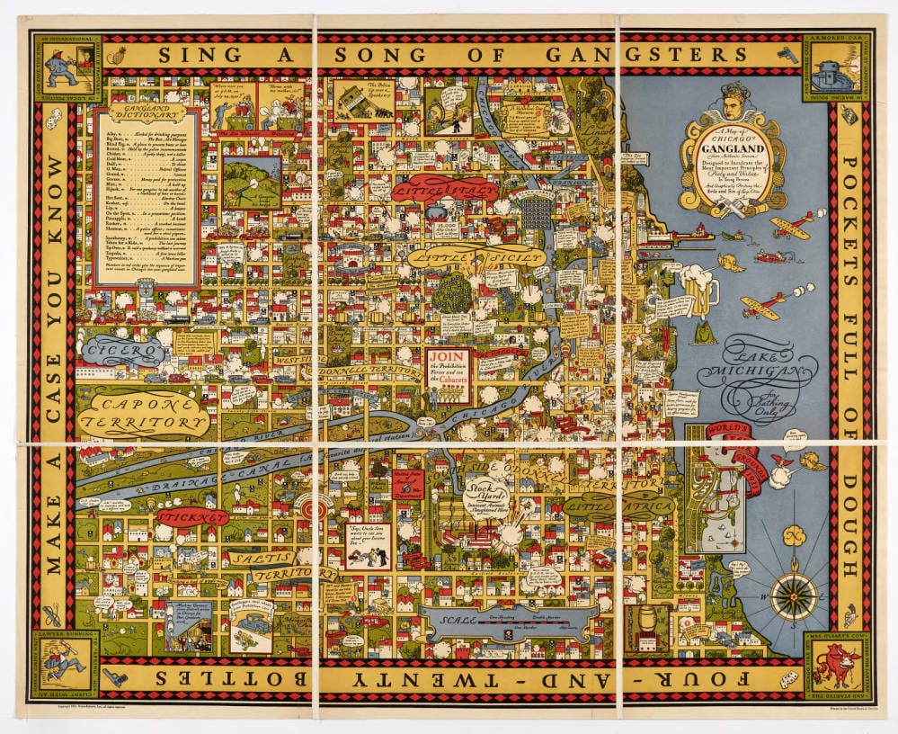
A certain type of gallows humor pervades this map, created in 1931 by Arthur Erickson. The crowned head of King Al Capone is perched atop the cartouche. Small skulls and crossbones are used to denote the locations of various gang-related slayings. A helpful glossary of slang terms is included. Countless stories are told in miniature in almost every square inch of the map. One might spend hours examining all of the small details of this map. It almost reminds one of the popular Where’s Waldo children’s book series from the late 1990’s. However, instead of finding a cheerful young man in a striped shirt, one finds only madness.
https://cdm17210.contentdm.oclc.org/digital/collection/p17210coll10/id/47/rec/27
Moving on, we come to one of the new additions to our online collection. This map of Paris, France was created by Ilonka Karasz in 1927 and is entitled Plan De Paris. Ms. Karasz, originally from Hungary, settled in the cosmopolitan neighborhood of Greenwich Village in New York City. She went on to design numerous covers for the New Yorker magazine during its early years. A retrospective exhibit of her work was shown at the Cooper Hewitt Smithsonian Design Museum in 2017.
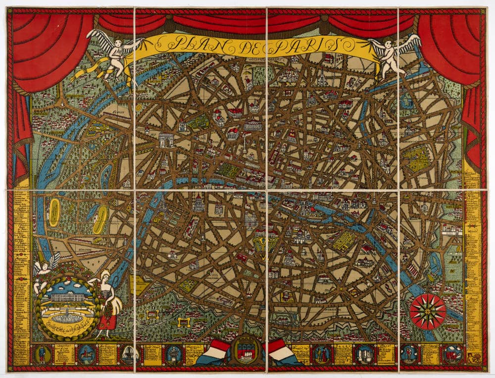
Like many other pictorial maps from time, this map uses bold primary colors to create a striking image. Red and yellow dominate the borders of the map, with the blue of the Seine River winds its way through the city. These colors help to break up the maze-like chaos of the endless boulevards, streets and ancient walls of the city proper, serving to keep the viewer from becoming overwhelmed.
https://cdm17210.contentdm.oclc.org/digital/collection/p17210coll10/id/62/rec/1
The next map in our cartographical journey should be of particular interest to librarians. Indeed, it is difficult to even imagine not including this work in this overview. The map in question is, of course, the Dewey Decimal Map of the United States.
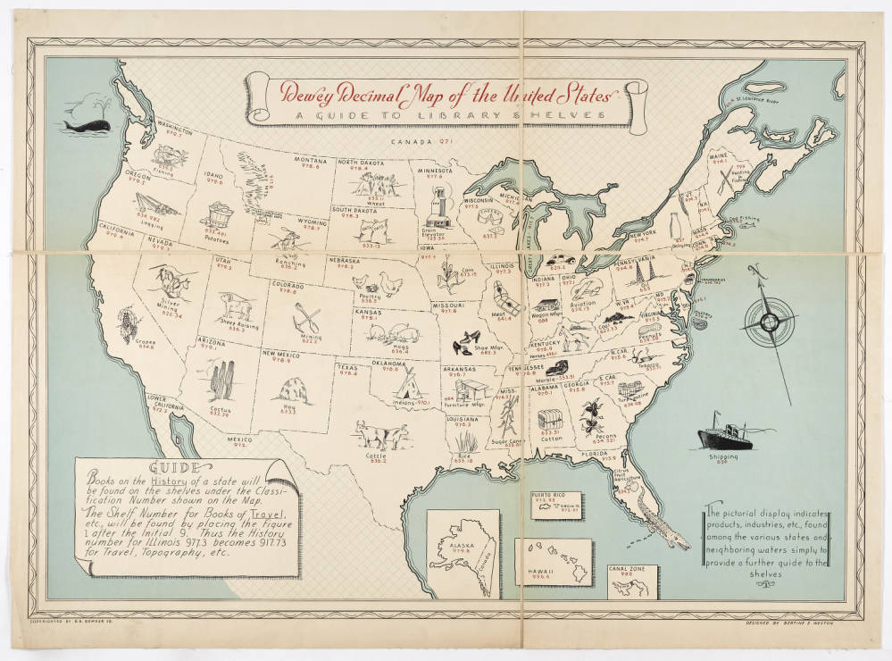
Bertine E. Weston was the creator of this map, which was originally published in 1936. The map offers a unique way of looking at the country. Within each state’s outlines, there is a small drawing of a product or resource particular to that area. Additionally, the proper Dewey Decimal number is provided. For example, Wisconsin features a wheel and wedge of cheese along with the corresponding Dewey number for cheese, 637.3. St. Louis, long known as “#1 in shoes”, gets a drawing of a pair of high heels, and the number 685.3. While the map is probably viewed with mild curiosity by most, true library aficionados should find much delight in it.
https://cdm17210.contentdm.oclc.org/digital/collection/p17210coll10/id/82/rec/1
A map is an essential part of any road trip. One would be hard-pressed to find a more intriguing travel map than that of Jo Mora’s The Seventeen Mile Drive from 1927.
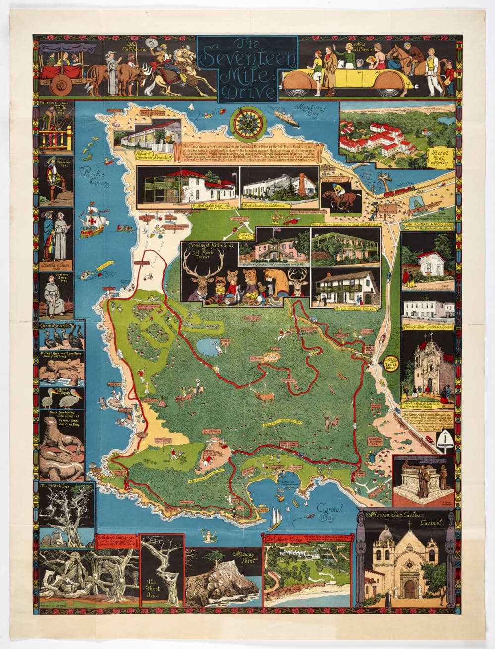
Technically the map is an overview of the scenic drive through the Monterey peninsula in northern California, now home to legendary golf courses and a world-renowned aquarium. Like so many of the maps in this collection, though, it includes so much more. At the very top of the map, there are drawings of two groups of people, “old” and “new” Californians. The old group consists of a cowboy and a padre and a group of women traveling in an ox-drawn wagon. The group of new Californians appears to be well-to-do tourists with golf clubs, a sleek convertible and a polo horse. Numerous drawings frame the border of maps, highlighting many of the indigenous species of birds and animals of the area as well as some of its historic buildings. The highlight of the map, though, has to be the center panel featuring a drawing of various forest-dwelling critters, all wearing human clothing.
https://cdm17210.contentdm.oclc.org/digital/collection/p17210coll10/id/88/rec/1
For our final example, we turn towards home, with this unique map of the St. Louis metropolitan area, one that highlights the educational and cultural enterprises of our city.
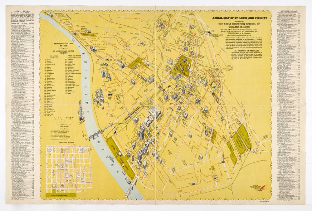
In addition to having a birds-eye view of the city and a striking yellow and orange design, this map has a rarely seen, south-facing perspective. Another odd thing about this local map is what it is missing. There is no Arch to be seen on the riverfront. The map was created by Owen Klooster for the Adult Education Council of Greater St. Louis in 1946. The Arch would not be completed until 1963. Close examination of the map shows a number of things that no longer exist, such as the Old Rock House, the Admiral, the Arena and a number of Library branches. All in all, this map offers a unique image of a city that was about to change considerably.
https://cdm17210.contentdm.oclc.org/digital/collection/p17210coll10/id/92/rec/1
By now, it should be apparent that maps come in a vast array of styles and formats. While the popularity of pictorial maps eventually began to wane after WWII, their influence in modern design persists to this day, in things as diverse as graphic novels and shopping mall floor plans, to name but a few. Who is to say what the future of pictorial maps may be? In time, we may grow tired of the wayfinding apps that plot and track our every step. Could a new golden age of pictorial maps be in our future? If only we were so lucky.
If you liked these maps, then please take a look at our online collection, which now includes 100 items. Please follow this link to view the collection: https://cdm17210.contentdm.oclc.org/digital/collection/p17210coll10
For further reading, we highly recommend Stephen J. Hornsby’s 2017 title, Picturing America the Golden Age of Pictorial Maps. https://slpl.bibliocommons.com/v2/record/S198C257118
Call Rare Books & Manuscripts at 314-539-0370 or email us at rarebooks@slpl.org if you would like to view the book or see any of the maps in person.

Add a comment to: Pictorial Maps